Web browsers: Vivaldi
I have tended to think that, while there are technical differences, in practical terms web browsers are commodities. Others may disagree but I’ve been using Vivaldi for a few months and I love it.
It feels like Vivaldi has broken from the pack. It’s hugely customisable, so I can cover only a small fraction of its features in this article, but I get huge value from just those.
Part of a series:
- Introduction. About the series.
- The key to finding things. Tags.
- Browsers. Vivaldi.
- Bookmarks. Raindrop.io.
- Emails. Outlook.
- Files. Everything and XYplorer.
- Music. MP3tag and Musicolet.
Vivaldi helps find things
I used to lose a website all-too-often. Was it a closed tab? Or perhaps it was one the many open tabs? Vivaldi has helped in several ways:
- A speed dial for one-click site access
- Grouping of sites into workspaces
- Simple access to search and site history
I now rarely lose a site. I don’t need to keep too many tabs open. If I lose something I can usually easily find it, using a variety of methods.
A visual introduction
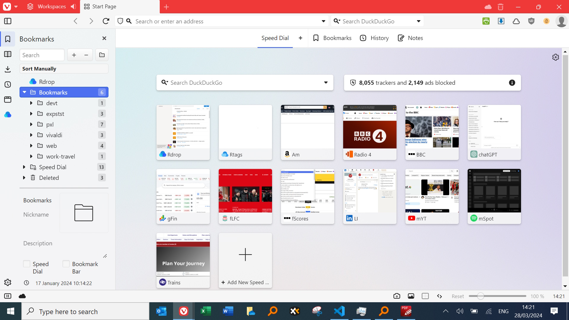
We’ll refer to this screenshot later. One thing not covered is the taskbar at the bottom of the screen; this gives me nice 1-click access to key apps but belongs to Windows, not Vivaldi.

1 - Flavours: Desktop, Android and iOS
You can install Vivaldi on desktop (Windows for me) and mobile devices (Android for me). Vivaldi apparently also works with iOS, although I haven’t been able to test that.
You can (optionally) sync things (e.g. bookmarks, workspaces - see below) across devices. This reuires registration, but they don’t spam.
There are, of course, slight differences across Android and Desktop - see “Built in tools” below for one example - but it’s an impressive achievement.
2 - Security
Look to the right of the graphic. Vivaldi has blocked 8055 trackers and 2149 ads.
Vivaldi has nice internal blocking of ads and trackers which plays nicely with browser extensions doing similar things e.g. uBlock Origin.
3 - More one-clicking
I love the one-click idea: put things in the right place and one click later the magic starts.
Sometimes this one-click approach comes “out of the box”, but often the user needs to do one-off work, teasing the app to cooperate.
Vivaldi makes one-clicking easy. Let’s look at speed dial.
4 - Speed dial
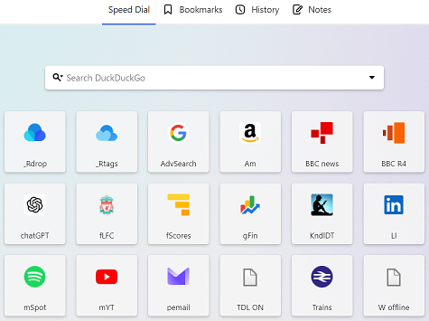
My use of Vivaldi – and specifically its speed dial feature – has already changed slightly since the graphic above. Vivaldi is customisable and I’ve chosen DuckDuckGo as my search engine, for privacy reasons. I have also dropped the tracker space hog from the display. Easy.

I’ve expanded the speed dial list of sites for which I have one-click access from 14 to 18 and dropped the “add a new site”, as I can do this by just double-clicking. My one-clicks, working from the top:
- Bookmarks, using raindrop.io.
- Bookmark management - a separate page at raindrop.
- Google advanced search
- Amazon UK jumps straight to my lists.
- BBC news – web page.
- BBC Radio 4.
- chatGPT.
- Football: Liverpool FC.
- Football: Premier League scores link bypasses recent search engine mess.
- Google finance.
- Kindle reader.
- LinkedIn.
- Spotify – YouTube diversification.
- YouTube – for background music; customise for a deeper dive.
- Private email.
- Transformaction online.
- Plan train trips.
- Offline web development.
The speed dial has saved me time. It’s probably only 5-30 seconds a time, but it adds up and helps preserve flow. A few examples:
- I couldn’t remember its address, so used to search for Google advanced search(!)
- You might type in cha … for chatGPT you might be distracted by Charlies Munger dies.
- Clicking Amazon UK goes to my list of lists, no longer hidden in the Amazon UI. Search is also available from that page of course.
- Who’s going to remember https://www.bbc.co.uk/sport/football/premier-league/scores-fixtures for football scores? And searching is no good when the results get tweaked.
- And trains: is that National Rail or TheTrainLine? Better get it right once and for all.
Of course I could put these under bookmarks, but these tend to get clogged up and in practice can be anything but speedy. Similarly for other techniques. The speed dial is there when I open a new tab.
5 - Customisations
Just one example: on my speed dial page I can easily order and re-order the squares - alphabetically or otherwise. I can also resize the squares; this is useful if you have a lot of items on the speed dial and are working on a laptop or smaller device. Items can too easily drop “below the fold”.
To avoid scrolling, drop the square size and set the maximum number of items per row. All accessible through the settings cog on the bottom left icon on the graphic.
6 - Side panel
On the top left of the graphic are a number of icons: below the Vivaldi icon we have the side panel, the bookmarks (highlighted), a reading list, the downloads, my website history, quick access to my workspaces and my raindrop.io extension.
You can customise the side panel icons; I’ve hidden some.
7 - Workspaces

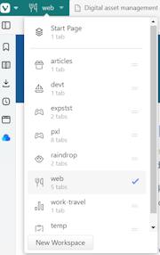
You can group related tabs into a "workspace" then switch between workspaces, using the icon on the top left.
My current workspace - web - has five tabs. I could switch to my expenses workspace - expstst - and two relevant tabs would be loaded.
Reviews indicate that some people love this feature, regarding it as a game changer. Perhaps I will come to agree as my practice develops?
8 - Bookmarks
Browsers don’t handle bookmarks well, so many third-party tools have been developed. I use raindrop.io and consequently use bookmarks in Vivaldi minimally.
In each workspace I have a set of tabs (websites) which load when the workspace is selected. It’s easy to close one of those tabs accidentally, when the tab will be lost to the workspace.
Therefore for each workspace I have a folder (under bookmarks) in which I more permanently store my list of workspace websites - and nothing else.
9 - Built in tools
The side panel contains a number of things (history, downloads etc) which I find useful and more easily accessible than with other browsers where they are more hidden away.
Vivaldi offers email and calendar and many more features.
I’m personally not too demanding in terms of my need for other tools; my primary need is a good browsing experience. I’ve already covered that Vivaldi is not great for bookmarks, largely because it does not let you use tags. I resolve this by using other tools.
But one occasional need is to capture an area of a web page as a graphic - or indeed the full page, which may involve some scrolling. This works perfectly on Android, although the graphics are correspondingly narrow.
On a desktop it’s a little trickier. The camera icon suggests everything should work - you get the “selection” and “full page” options. But the full page only captures the viewable screen and doesn’t scroll. This is hinted at in the Android-specific help topic.
Until The Vivaldi team get to this I’ll use the Go Full Page extension.
10 - Extensions
Vivaldi is a Chromium web browser which means, among other things, that browser extensions on the Chrome web store work with Vivaldi as well as Chrome. No headaches there.
Today I use just 6 extensions to enhance features and productivity.
In conclusion
This article shows just a few of Vivaldi’s productivity-related features. There are many more.
If you do decide to give Vivaldi a try I hope you enjoy it as much as I have.